
I like understanding how a product works before deciding how it should look.
For 4 years I've been designing digital products and design systems, from single components to multi-brand ecosystems. My background in industrial design leads me to think about constraints, scalability and consistency before I even open Figma.
I like understanding how a product works before deciding how it should look.
Three projects that show how I work: from problem to system, from system to product.
Giacomo brings a good balance between attention to detail and big-picture vision. He is particularly good at bringing order to complex systems and at working with designers and developers to turn ideas into concrete products.
Giacomo has a very concrete approach to design systems. He can get into the details without losing sight of the big picture and, above all, he turns complex problems into solutions that are simple to use and maintain.
Working with Giacomo was easy and stimulating. He is curious, precise and doesn't stop at the most obvious solution: he always tries to understand the problem before designing. His contribution improved both the product and the way the team worked.
I like talking about design systems, digital products and new opportunities.
Navigation and homepage weren't guiding users toward purchase. After a usability test and an A/B test with poor results, we rebuilt the homepage following the AIDA model, raising navigation success from 29% to 80%.
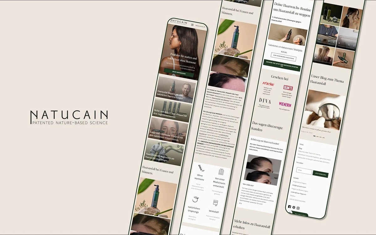
Natucain is a German e-commerce brand focused on hair regrowth, built on Shopify.
The navigation wasn't intuitive and the homepage didn't communicate the product's value right away.
The navigation structure wasn't intuitive and the homepage didn't clearly communicate the problem the product solves. As a result, some users left the site before they had even understood its value.
The work therefore split into two directions: making the navigation structure more intuitive, and rethinking the homepage with a more effective communication logic, validating the choices through real tests rather than assumptions.
We tested the navigation with a reverse tree test on 15 users.
For the homepage, a first A/B test on bounce rate, scroll rate and clicks gave no positive results. We therefore redesigned the page following the AIDA model: Awareness, Interest, Desire, Action.
Each correct answer scored +1, while each wrong answer scored -2.
For the homepage, we tested a first redesign with an A/B test, looking at bounce rate, scroll rate and clicks on the main events.
The results weren't positive on any of the three parameters. So we decided to start over and rebuild the homepage following the AIDA model: Awareness, Interest, Desire, Action, giving each section a precise role and repeating the interest and desire blocks after the first call to action.


The first redesign was a useful failure.
Instead of continuing to tweak the page, we went back to the method, giving each section a precise role in the user's journey.
The A/B test had improved neither bounce rate, scroll rate nor event clicks. This led us to change approach: stop moving elements around the page and start over from the method.
We then systematically applied the AIDA model, giving each section a precise purpose within the user's journey.
A negative test isn't a failure: it let us rebuild the homepage starting from method, not instinct.
The new navigation went from 29% to 80% success, with a test score going from -102 to 72 points.
The new homepage immediately communicates the problem the product solves and brings back the key content after the first call to action.
The new homepage makes the problem the product solves immediately clear and repeats the persuasion blocks after the first call to action, also catching users who weren't convinced yet.
Investing in, buying or financing a property in Dubai meant handling separate tools. PRYPCO brings research, investment and mortgages together in a single ecosystem.
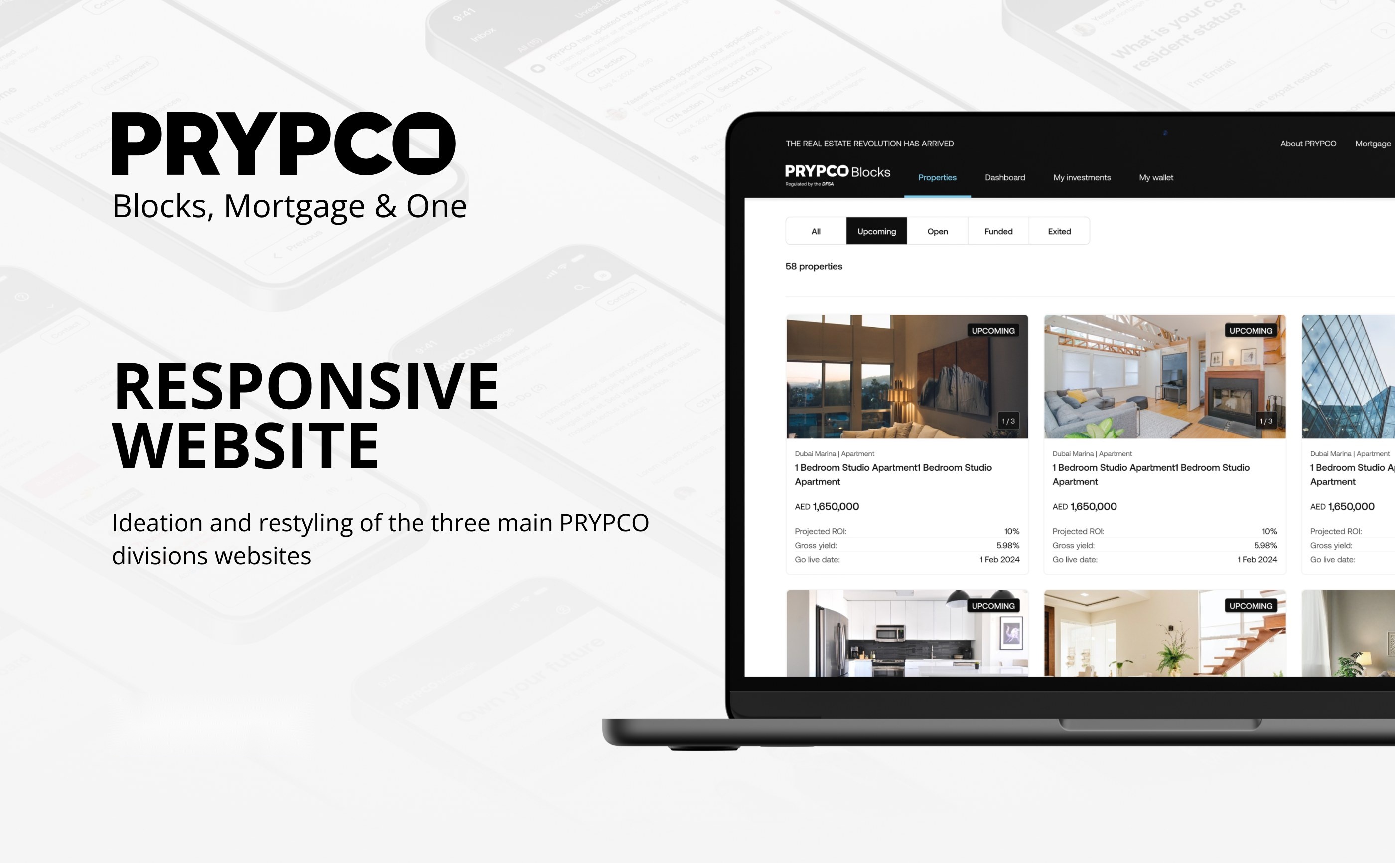
PRYPCO is a real estate ecosystem made up of three sub-brands: Blocks, One and Mortgage.
They have different audiences and identities, but they have to feel part of the same family.
Each product has its own audience and visual identity, but still has to be perceived as part of the same family.
The challenge was designing components and screens for three different products, from low-fidelity wireframes to final interfaces, keeping consistency across brands without flattening their identities: same structure, specific palette and typography for each sub-brand.
We started from low-fidelity wireframes to define flows and hierarchies.
We then built a shared design system, with Aeonik, an icon set and a component library used across the three brands.
We then built a shared design system based on the Aeonik type family, a consistent icon set and a component library (buttons, text fields, checkboxes, radio buttons, avatars, toggles and chips) used across the three brands.
From there we moved on to the high-fidelity interfaces for mortgage, fractional investment and property search.

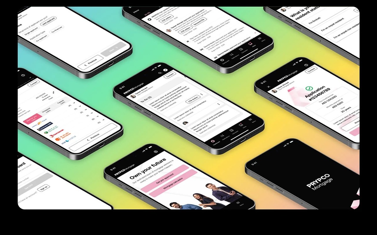

The system includes six dedicated palettes: Corporate, One, Blocks, Services, Mortgage and Rewards.
The token structure keeps each brand's identity without redesigning components from scratch.
Each product keeps its own colour identity while using the same components and the same Aeonik typography.
The token-based structure makes it possible to create new screens and adapt them to the different brands without redesigning every element from scratch.
One system, many voices: the same component library changes depending on the brand that uses it.
A single system for three brands, from the first wireframes to the final interfaces.
The system is now used in production for the fractional investment, property search and mortgage products.
From low-fidelity wireframes to final interfaces, the system now supports the products for fractional investment, property search and mortgages, currently live on PRYPCO.
A semantic token layer and a shared design language for three brands, on web and app. One 3-layer architecture, primitive, semantic and component, instead of brand-by-brand exceptions.

The design system started from a single file where primitives, brand logic and component tokens lived together with no clear hierarchy. Brand was encoded in multiple ways at once, and spacing and radii were duplicated brand by brand even when there was no real need for it.
The result: every new brand or every update meant manual work — slow and error-prone.

We proposed a unified language — Primitives → Brand semantics → Theme semantics → Component — with palettes aligned by luminance, to guarantee contrast and AA accessibility across every brand.
In practice the constraint turned out to be too rigid: not every brand could express its identity while staying within those bounds. It required constant exceptions — "snowflake" tokens — every time a brand didn't fit the shared structure.

Brand and theme now flow into a single semantic layer, with dedicated modes for every combination — Brand1 Light, Brand1 Dark, Brand2 Light, and so on. Palettes stay consistent, but free from the forced one-to-one correspondence across brands.
The system now lives in a dedicated library — Foundations — containing only primitives and semantic tokens, connected as the single source of truth to separate platform files, each holding only component tokens.

Component tokens are the last layer of the system before the code: every property of a component — background, text color, border radius, spacing — is bound to a token, never to a raw value. A button's default and disabled states, for example, pull their colors and sizes from dedicated tokens such as button-color-background-primary-default or button-size-border-radius.
This is what makes the library a real "configurator" for production: change a semantic token upstream, and every instance of that component — across every brand and theme — updates automatically, in Figma and in code, without anyone touching the component itself.

The new semantic layer covers 312 token definitions — roles like primary background color, selection border, disabled icon — expressed across 6 modes (3 brands × light/dark), fed by roughly 420 consolidated primitive values.
All 1796 component tokens in the Cross App library are bound to the semantic layer, with no more scattered brand or theme logic and no hardcoded values left. From a file with 5 overlapping, inconsistent collections, the design system is now a 3-layer architecture — primitives, semantic, component — distributed across a shared library and consumed by multiple platform files.
(Note: these reflect the numbers once migration is fully complete.)